Welcome!
Today you'll learn how to create a high-converting Klaviyo pop-up to grow your list before and during BFCM.
We’ve tested pop-ups across hundreds of brands and the numbers show:
Pop-ups are the #1 driver for email sign-ups.
So, if you implement anything from this course it should be this, because everything else then becomes easier.
This blueprint is based on 1,500+ requests we’ve received from brands, agencies, and freelancers and it’s finally here, fully documented.
Note: If you haven't created an account overview yet, please do that first. Here's how:
Goal:
After this post, you’ll know:
- How to create a clean, compliant and converting pop-up
- Which copy, structure and media work best
- How to avoid bad user experience
- How to optimize for urgency, discount logic, and GDPR compliance
- Which settings actually matter for conversions
Setup
We’re using a 4-step layout:
- The Teaser, which appears when someone closes the PopUp.
- The Email Opt-In Page, which is the first page the customer will see.
- The Profile Info Page, where they will give you their email.
- The Success Page, where we confirm the signup.
This structure works for brands of any size and should be considered the default.
Of course you can run A/B testing but consider this the best practice baseline.
Create the Pop-Up
- Click here klaviyo.com/forms/create to create a new PopUp in Klaviyo.
- Click ‘Create new form’ in the to top right corner.
- Click ‘Save and design’.
Modify the Pop-Up
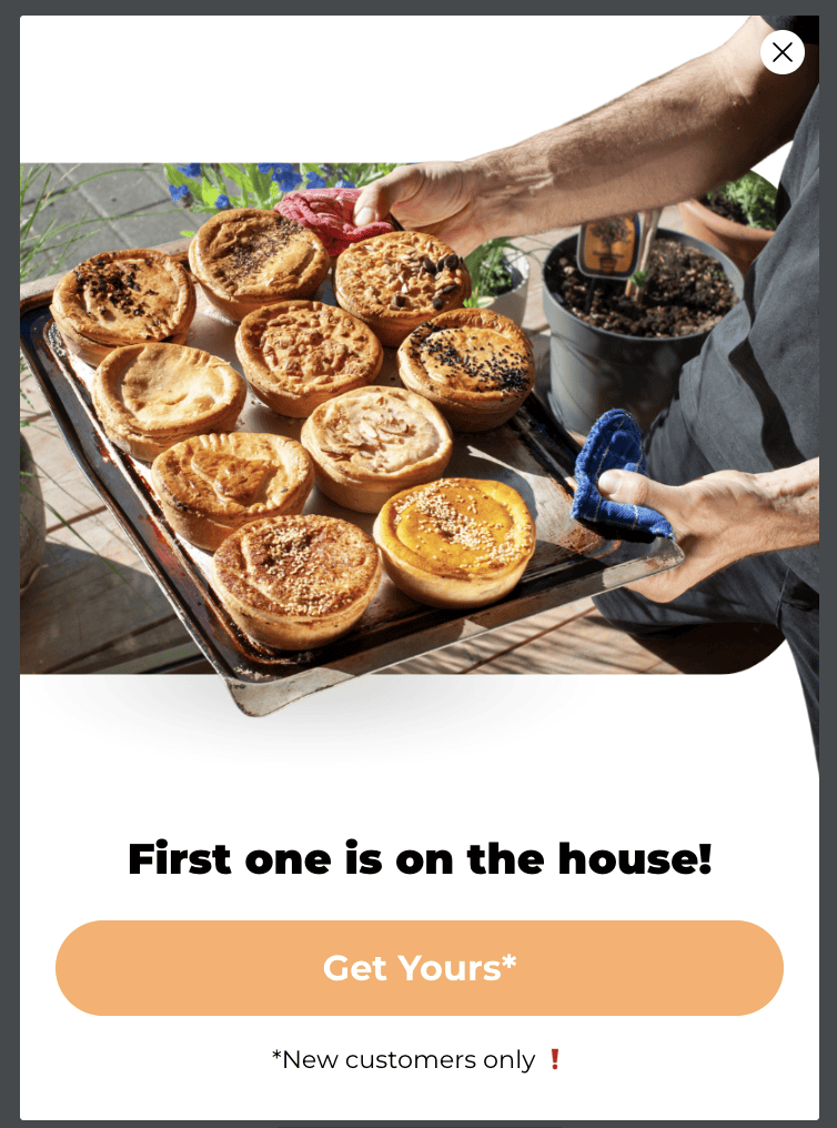
Teaser
Goal: Tease the offer without distracting too much.
Best Practices:
- Use emojis & short text
- Show the X (close) button
- Avoid overlap with cookie banners or chat tools
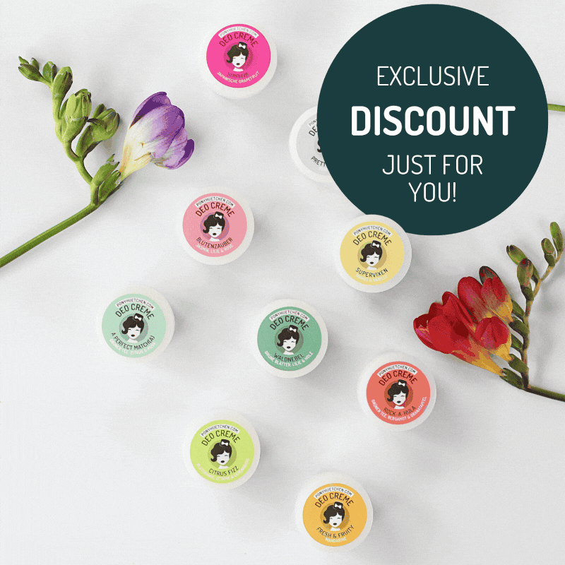
Email Opt-In Page
Goal: Convince the user to move one step further.
Best Practices:
- Use a GIF or minimal animation
- Don’t ask for email yet—use a button to advance
- Be direct, simple, and clear
- Add disclaimer: “For new customers only”, etc.
Profile Info Page
Goal: Get the data you need.
Best Practices:
- Keep it simple: Email or Email + First Name
- Add disclaimer: “We’re verifying your email”
- Avoid major design changes from the first page
Success Page
Goal: Confirm success & build urgency.
Best Practices:
- Use countdowns or time-sensitive language
- Mention limited code usage: “Only 500 codes left”
Adjust Your Settings
Trigger Type: Exit Intent (desktop + mobile)
Behavior:
- Don’t show on cart or checkout pages
- Don’t show after form submission
- Limit frequency (e.g. every 7 days if already seen)
Display Devices: All (you don’t need separate mobile/desktop forms)
Timing:
- Desktop: Exit intent
- Mobile: Scroll-based trigger or after X seconds
Targeting:
- Show only to users not in the list already (if possible)
- Use Klaviyo suppression if needed to hide from recent subscribers
UTMs:
- Add UTM to redirect link:
?utm_source=popup&utm_medium=email&utm_campaign=signup
Smart Sending: OFF
Optional: Integrate with Google Analytics or Aimerce pixel to monitor exact conversion.
Design the Pop-Up
Here are 3 layout options:
Option 1: Animated GIF Pop-Up
- Product jumping, rotating, or transitioning
- Strong CTA below (e.g. “Reveal My Code”)
- Tutorial: Use Canva, remove background, animate product

Option 2: Transparent Layered Design
- Product overlaps design border to look more premium
- Use Canva: Layer product with and without background
Option 3: Custom Shape Pop-Up
- Use non-standard shapes (e.g. hexagon, pill, frame)
- Helps break layout fatigue, improves brand perception

Once done, compress media for faster loading:
Grow Your List
No contacts = No emails sent = No revenue
So growing your list should be your main goal before and durign BFCM.
We’ve included a downloadable PDF (in Skool) with 25 list growth ideas. Some of them you can apply today, others may need dev support. But each one contributes directly to the long-term success of your email program.
What to Do Next:
- Create or review your existing Pop-Up in Klaviyo
- Update design, structure and logic based on above
- Preview and test it across devices
- Track results via List growth, Submit Rate and Revenue per Submit